Shading Techniques with Pencil
When I first started creating Zentangle art, I was confused about how to shade each piece. If Zentangle art is non representational, do the principles for shading that apply to other artwork still apply?
The answer is both yes and no. You can of course create a light source and use the normal rules that apply to adding shadows or you can be totally creative in where you shade your Zentangle art. I have now come up with 7 tips that will help you create fun, three dimensional drawings. In order to demonstrate these steps I will be using two easy Zentangle patterns. These patterns are ideal Zentangle patterns for beginnners.
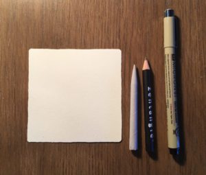
You will need a square paper tile (or any paper of your choice), a pencil, tortillon, and black pen (I used a micron PN)
Drawing the patterns
You can follow the step outs of the tangle patterns Printemps and Crescent moon, on
Zentangle Mosaic app or on tanglepatterns.com
Step 1
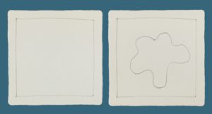
Draw a dot in each corner then join to create a border
Step 2
Draw an irregular closed shape in the centre of the tile as a string (The border and string are just guides to where your patterns will sit)
Step 3
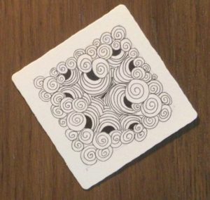
Between the border and string fill with the pattern Printemps
When drawing the printemps pattern, vary the size of each circular shape to create interest.
Step 4
In the centre of the tile within the closed shape draw the pattern Crescent Moon.
7 Tips to help you shade your Zentangle Art
#Tip 1 How much ink did I use?
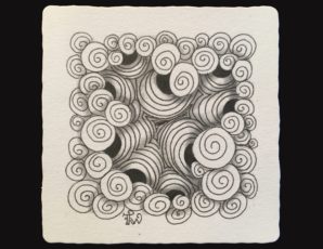
The more ink you have used on your drawing, the less shading is required.
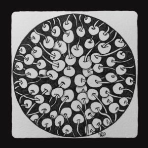
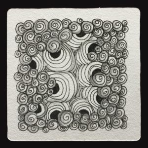
As you can see in the above example, there is a lot of ink but very little shading.
The tile we just created used less ink so more shading will be required.
#Tip 2 What do I want to stand out?
Pick the part of your pattern that you would like to stand out from the rest.
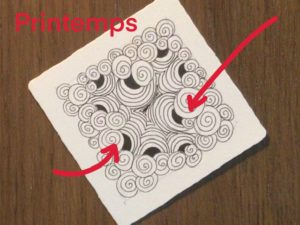
In this piece I have decided to let the Printemps pattern stand out. To make it stand out it will need it to be lighter in colour as darker colours recede.
#Tip 3 Where do I want my eyes to travel?
Where do you want your eyes to travel when looking at your piece of art?
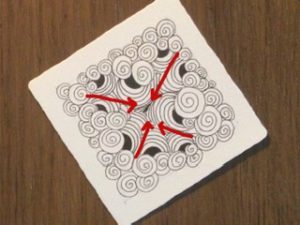
I want my eyes to travel down into the centre of the tile as if looking down into a canyon.
#Tip 4 Are there any shapes that are round or curved?
If any patterns are round or curved, shading can emphasise the roundness of the pattern. In the tile I just created I want to emphasise the curves in the crescent moon pattern.
#Tip 5 Do any of my patterns overlap?
If any patterns are overlapping, place a shadow on the pattern underneath.
The Printemps overlaps the crescent moon so I will place a shadow under the rim of the Printemps casting a shadow over the crescent moon.
The Printemps also overlap each other so I will draw a faint shadow where these overlap. It is important to keep the Printemps light in colour so that it stands out.
#Tip 6 Build up shadows gradually
Start shading lightly, you can always build up the intensity of the shadow later on,
#Tip 7 Leave some white spaces
If the shading is overdone, it takes the effect away from the piece so it is important to leave white spaces.
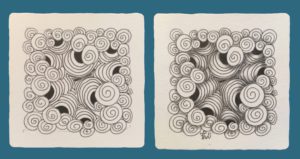
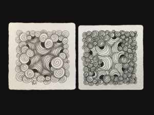
Notice how the shading makes the patterns pop? By emphasising the crevices with shading, our eyes are drawn down into the centre of the tile. The lighter colour of the Printemps makes it stand out from the rest but with a little bit of shading where the patterns overlap makes some shapes look to sit above what is drawn behind. By shading around the curves of the crescent moon, the roundness of these shapes have been emphasised.
There are no rules to shading Zentangles. Here is an example of how the tile might look if I placed the shading in other areas:
which do you like the best?
To make things a little bit easier follow along with this video:

How did you go?
I hope this helped with shading your tangles.
I would love to hear how you went with your shading so leave a comment below and if you have any questions please ask.
Happy shading!
Hello maam i like second one ,which has light shade in center n dark in outer design
Thank you for your comment Alankar. It is fun to experiment and try out different ideas to suit our individual preferences.
This is so helpful – thank you!
Thank you Ellen. I’m glad you found this helpful.