One of the questions I see often within the Zentangle® Community is How can I improve the composition of my art?
Before I begin and get into the nitty gritty of formal art composition remember this:
If your art looks good, it is good.
There are lots of articles on the internet or in books about how to compose good art, they talk about principles and elements of art or design but these can be confusing. The amount of principles or elements can vary from one article to another.
One of the analogies I came across when researching this topic compared the composition of art to that of composing language. Here is a link to that article: Some Ideas About Composition and Design Elements, Principles, and Visual Effects © Marvin Bartel. The author wrote “the formal aspects of visual composition are like the grammar of a language.” “The use of design principles applied to the visual elements is like visual grammar.” When we have learned the “language of vision”, we can express our visual ideas to become “visual poets”.
In this post I will give you my take on the whole subject and offer you some art composition tips. I hope it helps you to improve the composition of your art.
What are the elements and principles of art?
Do we need to know these elements and Principles? Of course not! – BUT good composition requires natural intuition and may take a lot of trial and error.
If you think of your overall piece of art as a Meal, The various dishes served in this meal require a recipe (principles) To execute these recipes we use ingredients or tools. (elements)
So Let’s have a closer look at these principles and elements – I’m just selecting the ones that I feel relevant to Zentangle Inspired Art. You of course can apply others.
Basic Principles of Visual Design
You decide which of these principles to use. You may not use them all in one piece so don’t feel that you need to tick all the boxes.
- Rhythm – created by movement implied through the repetition of elements in a non-uniform but organised way.
- Balance – provides stability and structure to a design and creates the perception that there is equal distribution. Can be symmetrical, asymmetrical or have radial symmetry.
- Emphasis – parts of the design that are meant to stand out
- Harmony – the belonging of one thing with another. The repetition of elements like colour, texture and shape are ways to achieve harmony in a composition.
- Variety – creates visual interest. Without variety a design can become monotonous. Too much variety can create chaos.
- Movement – the way the eye travels over the design. This is done through positioning, emphasis and other elements of design.
- Unity – how well the elements of a design work together
- Contrast – the placing of two elements, particularly adjacent elements to emphasise or highlight key elements in your design.
- Pattern – repetition of multiple design elements working together. (tangles)
Exploring the elements of design
- line – Lines are useful for dividing space and drawing the eye to a specific location.
- Shape – shapes are defined by boundaries, such as lines or colour and are often used to emphasise a portion of the page.
- colour – can be applied to other elements in the design such as lines, shapes or textures.
- Texture – texture creates areas of visual interest and can create a more three-dimensional appearance.
- Tone – a colour which is not a pure hue, white or black (achieved when we shade our work with pencil)
- space – can be positive or negative. The parts of the composition that are left blank (either white or some other colour), help to create an overall image.
- Value – The lightness or darkness of tones or colours
Other Considerations
Keep it simple – sometimes less is more! Here are some ways of incorporating simplicity in your overall composition
- reduce the clutter in your design to enhance the focal points
- use a limited palette
- reduce detail in unimportant areas
Odds– on odd number of subjects in an image is more interesting than an even number. An even number produces symmetry which can appear unnatural or overly formal.
THE NUMBER THREE seems to be the magic number. You may have heard of the rule of thirds.
- Rule of Thirds – a guideline applied to the process of composing. This guideline proposes that the canvas or work surface be divided into nine equal parts by two equally spaced horizontal lines and two equally spaced vertical lines. The important elements are then placed along these lines or their intersections.
- Triangles – composed by intersecting THREE lines. These shapes are pleasant to the eye and create a sense of stability and strength.
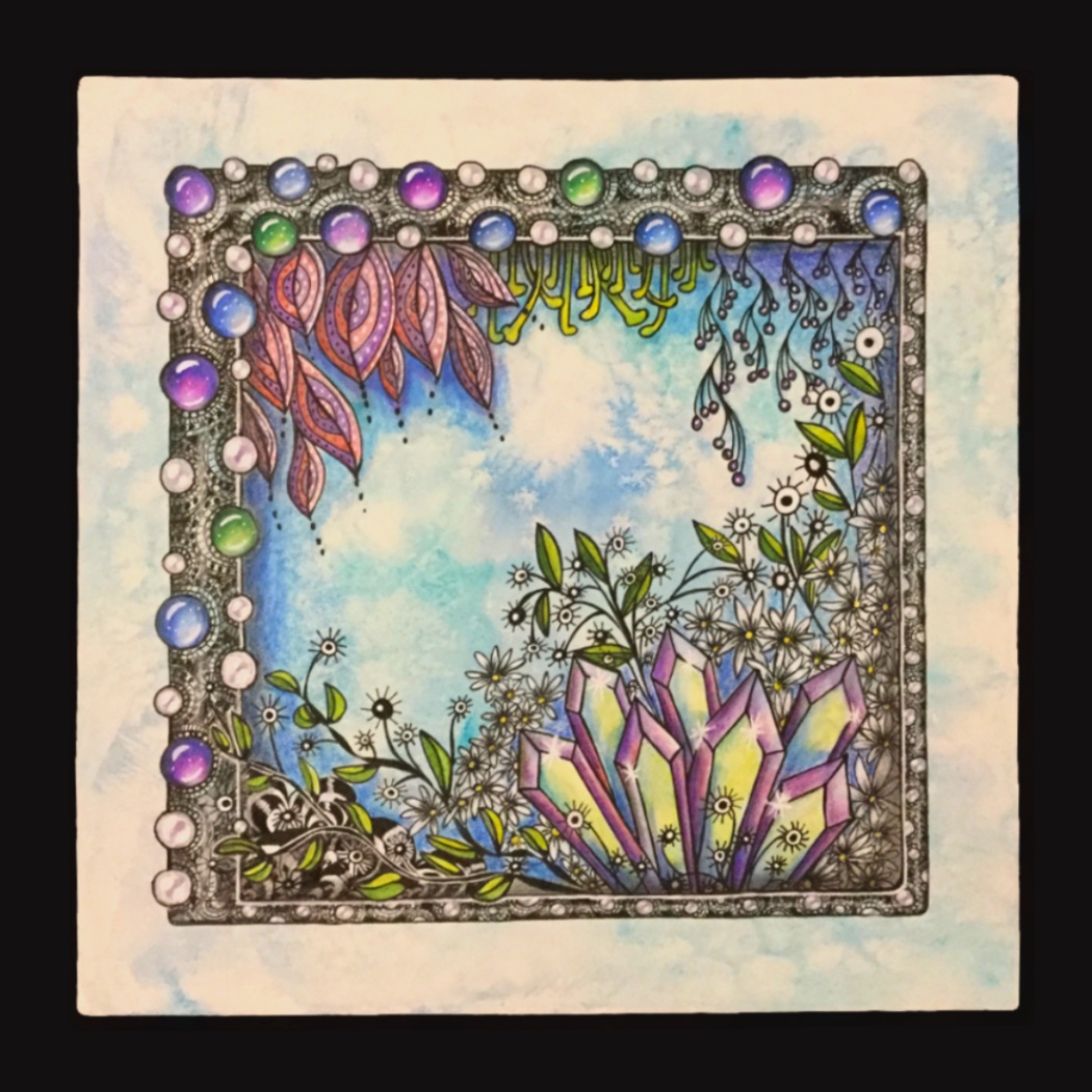
Putting these principles and elements into practice
I have created a video to demonstrate how I put these principles and elements into practice. You can watch it here:
How do I know if I have created a successful composition?
Ask yourself the following questions:
- Does it look good?
- Is the overall composition unified?
- Is there some variety?
- Are there any areas of contrast?
- Is there a focus point or an area of emphasis?
- Does the viewer’s eye travel over the design?
- Is the overall composition balanced?
I hope these tips were helpful!
Thank you for the information. Your piece is Beautiful!
Thank you Elle!
Excellent cours sur la composition, j’y vois un peu plus clair. Merci pour vos vidéos magnifiques
Thank you Sylviane!